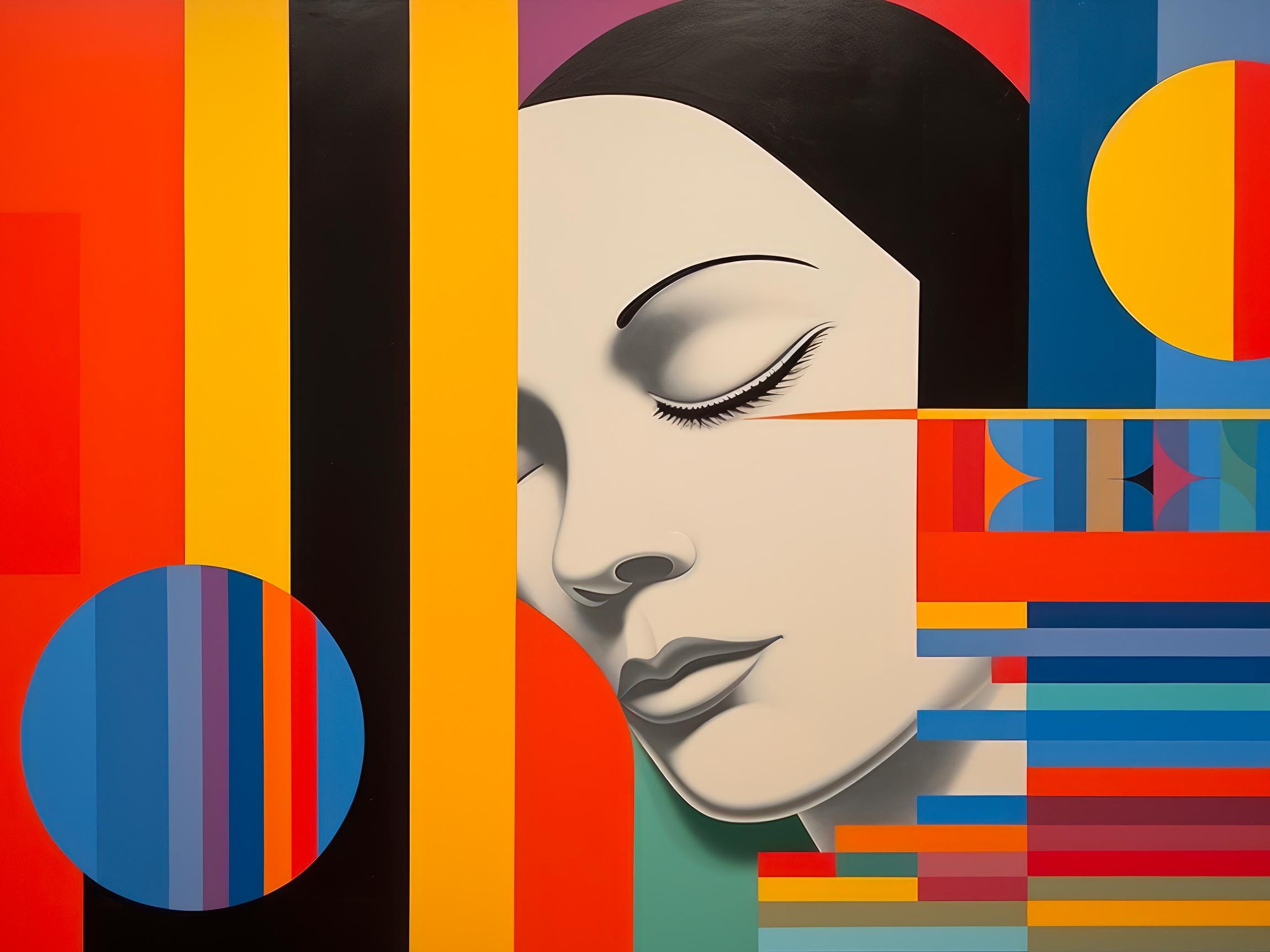
Colors are more than just visual elements; they are conduits of emotions, silent messengers that evoke feelings and perceptions. In design, understanding the psychology of colors is like wielding a palette of emotions that can shape user experiences and influence engagement. This article delves into the intricate relationship between colors and emotions, unveiling the powerful impact that color choices can have on design.
Colors: Beyond Aesthetics, Into Emotion
The language of color is universal, transcending cultures and languages. Red elicits excitement and urgency, blue instills calm and trust, yellow radiates warmth and optimism, and green evokes growth and balance. This innate connection between colors and emotions is deeply ingrained in human psychology, shaping our responses and reactions. In design, colors go beyond aesthetics; they speak to our subconscious, eliciting visceral reactions that profoundly influence our perception.
Red: The Power of Passion
Red is a color of extremes—passion, love, energy, and urgency. It demands attention, igniting a sense of urgency that drives action. Think of “Buy Now” buttons or clearance sale signs; red commands immediate attention, prompting users to make decisions swiftly. But red also treads on caution, symbolizing warnings and alerts. In design, sparing and strategic use of red can create focal points that guide users’ attention and evoke intense emotions.
Blue: The Serenity of Trust
Blue, the color of the sky and ocean, exudes tranquility, reliability, and trust. It’s often associated with professionalism and stability. Financial institutions frequently employ blue to foster a sense of security and dependability. In web design, blue is a go-to color for creating a soothing user experience, evoking feelings of calmness and reliability.
Yellow: The Sunshine of Optimism
Yellow radiates positivity, warmth, and happiness—much like the sun on a clear day. It captures attention and stimulates the mind, making it a popular choice for call-to-action buttons or elements that need to stand out. However, excessive use of yellow can be overwhelming, so balance is key. In branding, yellow is often employed by brands that want to convey a sense of energy, creativity, and cheerfulness.
Green: The Harmony of Balance
Green symbolizes harmony, growth, and balance, drawing associations with nature and renewal. It’s a color that’s easy on the eyes, making it suitable for prolonged exposure. In design, green is often used to signify health, sustainability, and environmental consciousness. Brands that emphasize eco-friendliness or well-being may opt for shades of green in their designs.
Real-World Examples: The Impact of Color Choices
Consider the website of a fitness app. The designers opt for a palette dominated by vibrant shades of green and blue. These colors not only represent health and tranquility but also inspire motivation and determination—key emotions for users engaging in fitness activities. The judicious use of red accents in buttons and notifications adds an element of urgency, encouraging users to take immediate action, whether it’s signing up for a program or completing a workout.
On the contrary, imagine a charitable organization’s website dedicated to children’s education. The designers choose a warm and welcoming palette of soft yellows and bright oranges. These colors exude positivity and optimism, creating an environment that encourages parents and donors to engage with the cause. The restrained use of blue instills confidence and reliability, assuring visitors that their contributions will be used effectively.
The Palette of Perception
Colors are not just visual embellishments; they are profound tools that shape the way we perceive and experience the world around us. In design, the psychology of colors is a potent language that can communicate emotions, evoke reactions, and influence user behavior. By understanding the intrinsic relationship between colors and emotions, clients and designers can collaborate more effectively to create designs that resonate deeply with users, forging connections that extend beyond aesthetics.


