
In a world dominated by visuals, where every glance, click, or tap is a brushstroke on the canvas of communication, understanding the language of design has become essential. Design is more than mere aesthetics; it’s a visual language that conveys ideas, evokes emotions, and communicates messages with precision.
Color: The Palette of Emotion
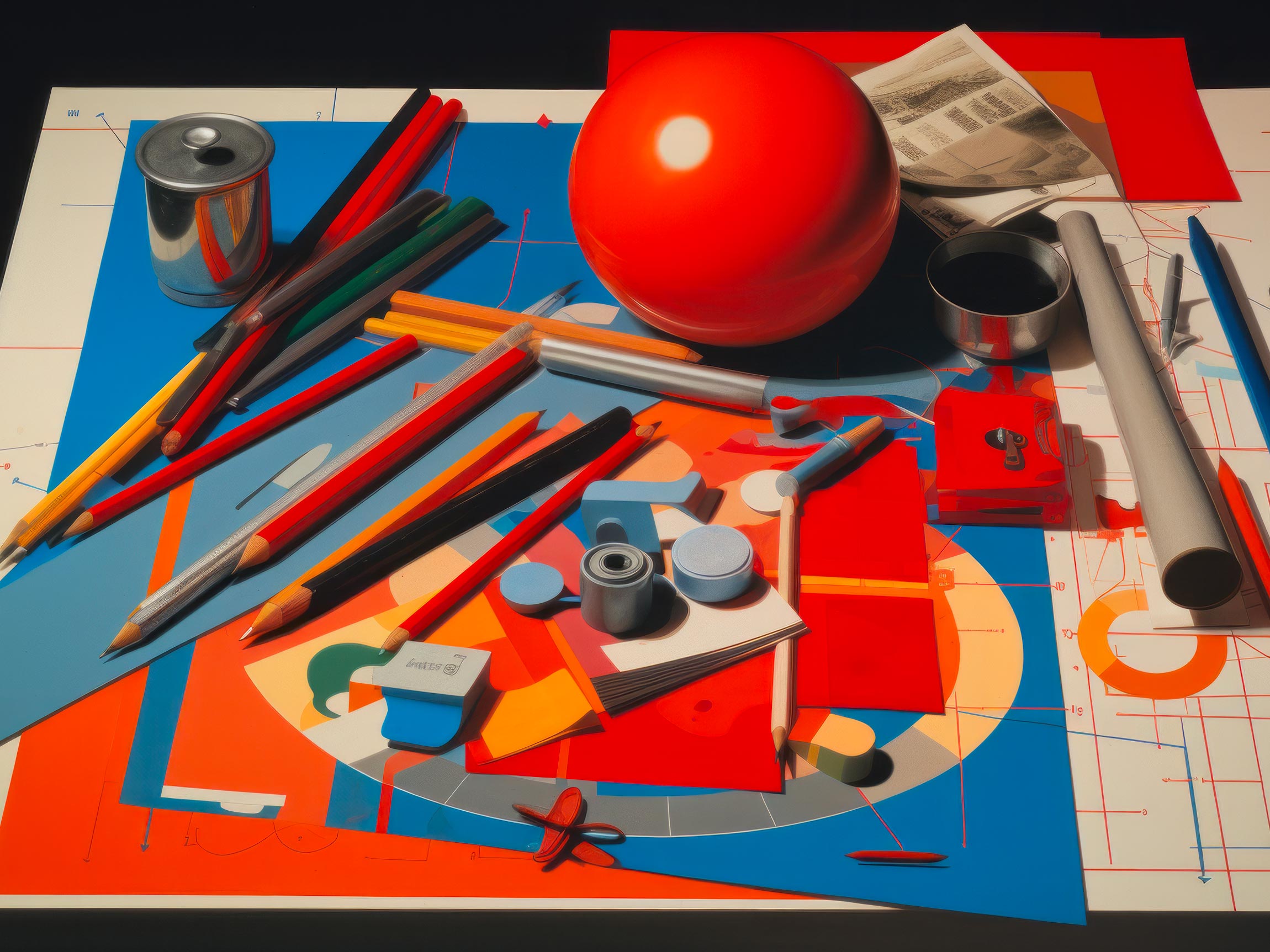
Color is the first brush that touches the canvas of a design. Just as a painter selects hues to evoke specific emotions, designers choose colors to communicate feelings, associations, and themes. Warm colors like red and orange convey passion and energy, while cooler tones like blue and green evoke calm and tranquility. Color harmonies, contrasts, and combinations dictate the visual mood, infusing designs with layers of meaning.
Typography: The Art of Textual Expression
Typography is the art of arranging text in a visually appealing manner. From bold headlines to elegant body text, each typeface carries a personality that aligns with the content’s tone. Serif fonts exude tradition and formality, while sans-serif fonts convey modernity and simplicity. Line spacing, letter spacing, and font size all contribute to readability and visual impact. Typography transforms words into a symphony of meaning, ensuring that the written message resonates with the intended audience.
Layout: The Blueprint of Structure
Layout is the architectural blueprint of design. Just as a well-organized floor plan optimizes space, a thoughtfully structured layout guides the viewer’s eye and emphasizes key elements. Grids, columns, and whitespace create order, facilitating content consumption. Balancing asymmetry and symmetry adds dynamism and visual interest. A harmonious layout ensures that information is presented in a logical sequence, enhancing both understanding and engagement.
Imagery: Pictures Worth a Thousand Words
Images speak volumes in the language of design. They evoke emotions, tell stories, and provide context. Just as a skilled storyteller selects vivid anecdotes, designers curate images that enhance the narrative. High-quality visuals resonate with viewers, creating a memorable connection. Imagery adds depth to design, breathing life into concepts and capturing attention in an instant.
Unity: The Symphony of Elements
Unity is the conductor that orchestrates the various design elements into a cohesive composition. It ensures that color, typography, layout, and imagery work together harmoniously to convey a unified message. Consistency in design elements cultivates familiarity, enhancing recognition and reinforcing branding. Like the rhythm that unites musical notes, unity weaves the design elements into a coherent and impactful visual story.
Hierarchy: Guiding the Eye
Hierarchy is the guide that leads the viewer’s eye through the design landscape. It establishes visual priorities, making important elements stand out. Just as a map highlights essential landmarks, hierarchy highlights key information. Bold headlines and contrasting colors signify significance, while subordinates like body text complement the main narrative. Hierarchy ensures that the viewer absorbs information in a structured and intuitive manner.
Emphasis: Spotlight on Significance
Emphasis directs attention to the focal points of a design. It’s like a spotlight that illuminates key elements. By manipulating color, size, contrast, and placement, designers emphasize what matters most. Emphasis enables hierarchy to shine, ensuring that the viewer’s focus aligns with the intended message.
Balance: The Equilibrium of Elements
Balance is the equilibrium that maintains visual stability. It’s the yin and yang that prevents the design from tipping over into chaos or dullness. Symmetrical balance creates order and formality, while asymmetrical balance infuses energy and dynamism. Like a skilled tightrope walker, balance ensures that design elements are distributed evenly, creating a sense of equilibrium and visual comfort.
Design Unveiled
Design is a language that speaks to the eyes and touches the senses. Each element—color, typography, layout, and imagery—contributes to a nuanced conversation that conveys messages, emotions, and stories. By understanding this visual language, beginners can decode the intricacies of design decisions, collaborate effectively with designers, and wield the power of visuals to communicate with impact.