

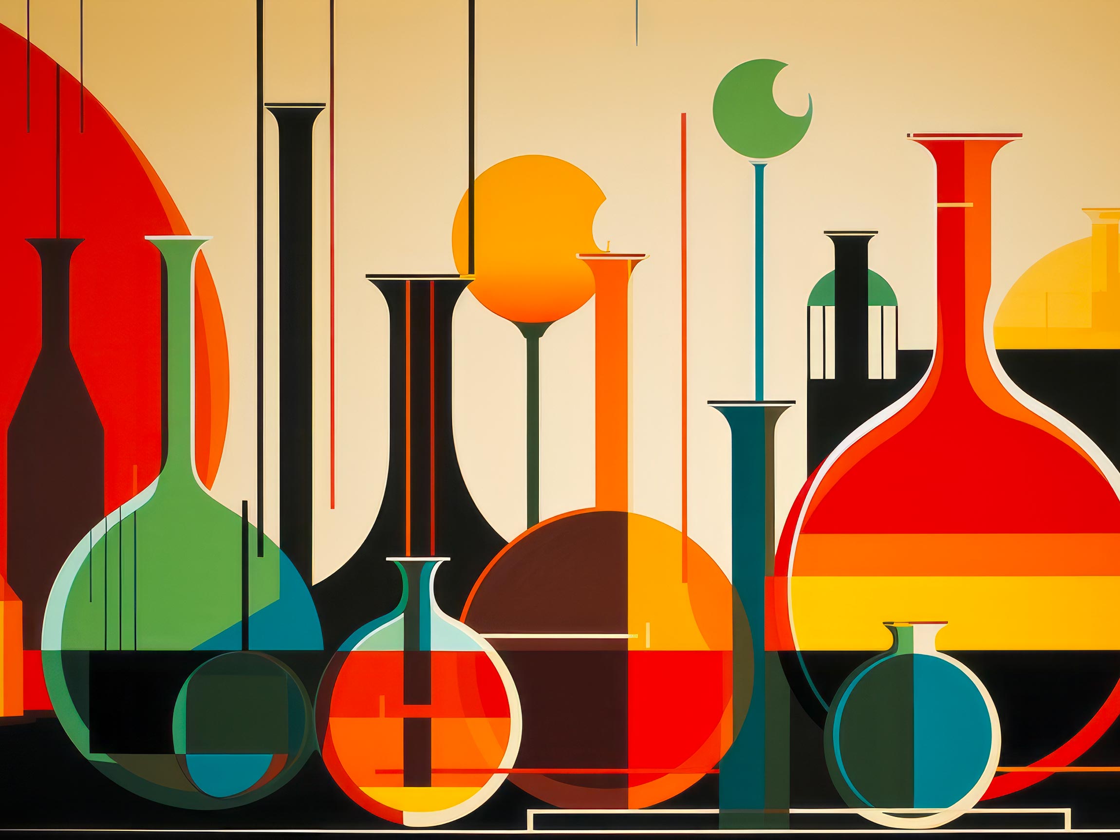
Just as elements in science come together to create compounds with unique properties, colors and design elements combine to yield striking visual reactions. Much like chemists manipulate elements to achieve specific reactions, designers harness colors to provoke emotional responses and communicate messages effectively.
Colors as Elements
In both design and chemistry, fundamental building blocks form the basis of all compositions. Elements in chemistry are the foundation of matter, and similarly, colors serve as the core components of visual compositions. Just as each element carries distinct properties, colors evoke specific emotions and associations.
Imagine a color palette as a periodic table, each hue occupying a unique position with its own characteristics. Red, fiery and intense, can be likened to a reactive metal in chemistry. Blue, calm and serene, resonates with the stability of a noble gas. By understanding the attributes of colors, designers can orchestrate harmonious compositions that engage viewers.
The Art of Mixing
In the realm of chemistry, combining elements can result in transformative reactions. Similarly, mixing colors in design can lead to visually engaging outcomes. The process of blending primary colors to create secondary colors shares parallels with chemical reactions that yield new compounds.
Consider the combination of red and blue, resulting in the vibrant purple. This fusion mimics a chemical reaction, where elements interact to form a novel substance. In design, this reaction translates into visual interest, capturing attention and evoking curiosity. By understanding the “color reactions,” designers can strategically apply these principles to captivate audiences.
Color Harmonies and Complementary Chemistry
Just as chemical reactions can be enhanced by complementary elements, design benefits from harmonious color pairings. The concept of complementary colors finds resonance in the chemistry of reactions that achieve equilibrium through balanced interactions.
For instance, the combination of red and green in design creates a striking contrast, much like the interplay of oxidants and reducers in chemical reactions. The harmonious discord between colors invites the viewer’s gaze, creating a visual equilibrium that’s both engaging and captivating.
Visual Catalysts: Context and Perception
In chemistry, catalysts are substances that accelerate reactions without being consumed in the process. Similarly, in design, context acts as a catalyst that intensifies the impact of colors and elements.
Consider a minimalist design with a pop of vibrant color – a visual catalyst that draws attention amidst a neutral backdrop. This phenomenon mirrors the role of catalysts in chemistry, where a small presence can lead to significant transformations. The context in design acts as an amplifier, making colors and elements resonate more powerfully with the viewer.
Beyond Aesthetics: Emotional Compounds
Chemical compounds often possess unique properties beyond the sum of their elements. In design, the fusion of colors and elements generates emotional compounds that resonate deeply with viewers.
Think of a warm color palette – the amalgamation of red, orange, and yellow. This combination evokes feelings of energy, passion, and positivity, just as a chemical compound might exhibit unexpected characteristics due to the synergy of its elements. Designers, like chemists, have the power to craft emotional compounds that elicit specific reactions from the audience.